Coffee House Rebrand Case Study
Challenges:
Throughout the rebranding process, I faced several challenges. Because the project extended beyond designing a logo to reimagining the coffee house as a whole, it was essential to find the right balance between gaming culture and a welcoming coffee shop aesthetic.
Another challenge was determining the initial direction for the logo. The original branding consisted solely of text, which made it difficult to decide how far to push the redesign while still creating something cohesive and recognizable.
Key Aspects:
Target Audience: teens to adults
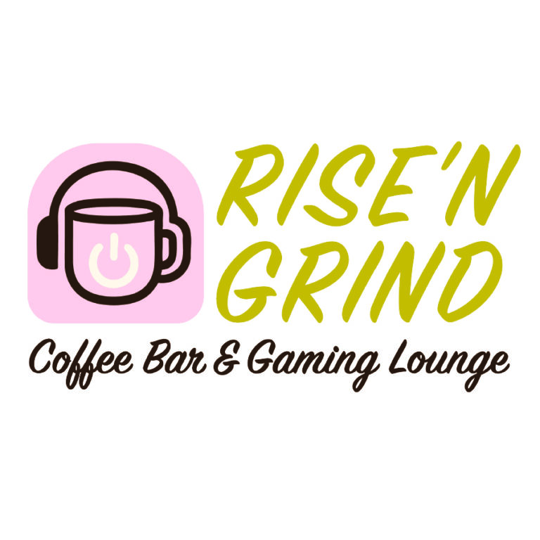
New Logo: clearly grasps the look of both a coffee house and a gaming lounge and is much more eye-catching to the public than the previous logo
Before & After:
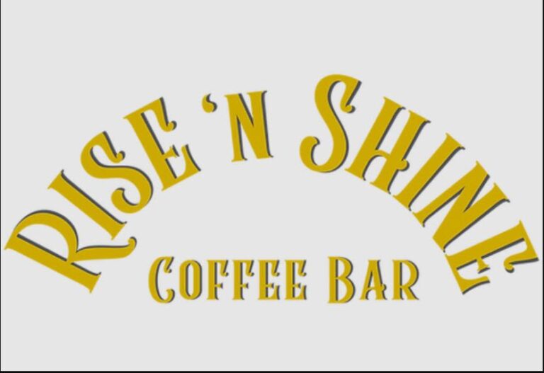
The original Rise N’ Shine logo was a text-only design, which offered limited visual impact and did little to communicate the personality or atmosphere of the café. While functional, the logo lacked a distinctive identity and did not reflect the potential for the brand to stand out within the local coffee scene.
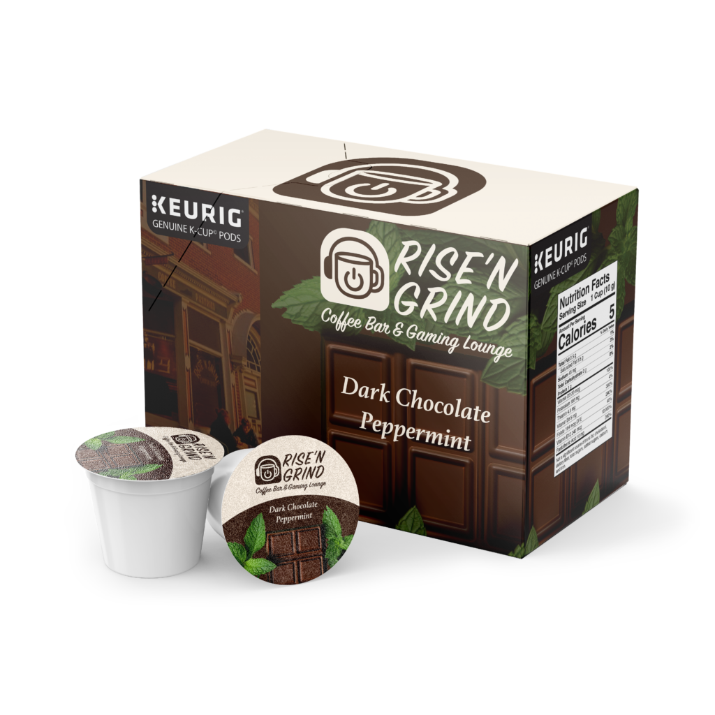
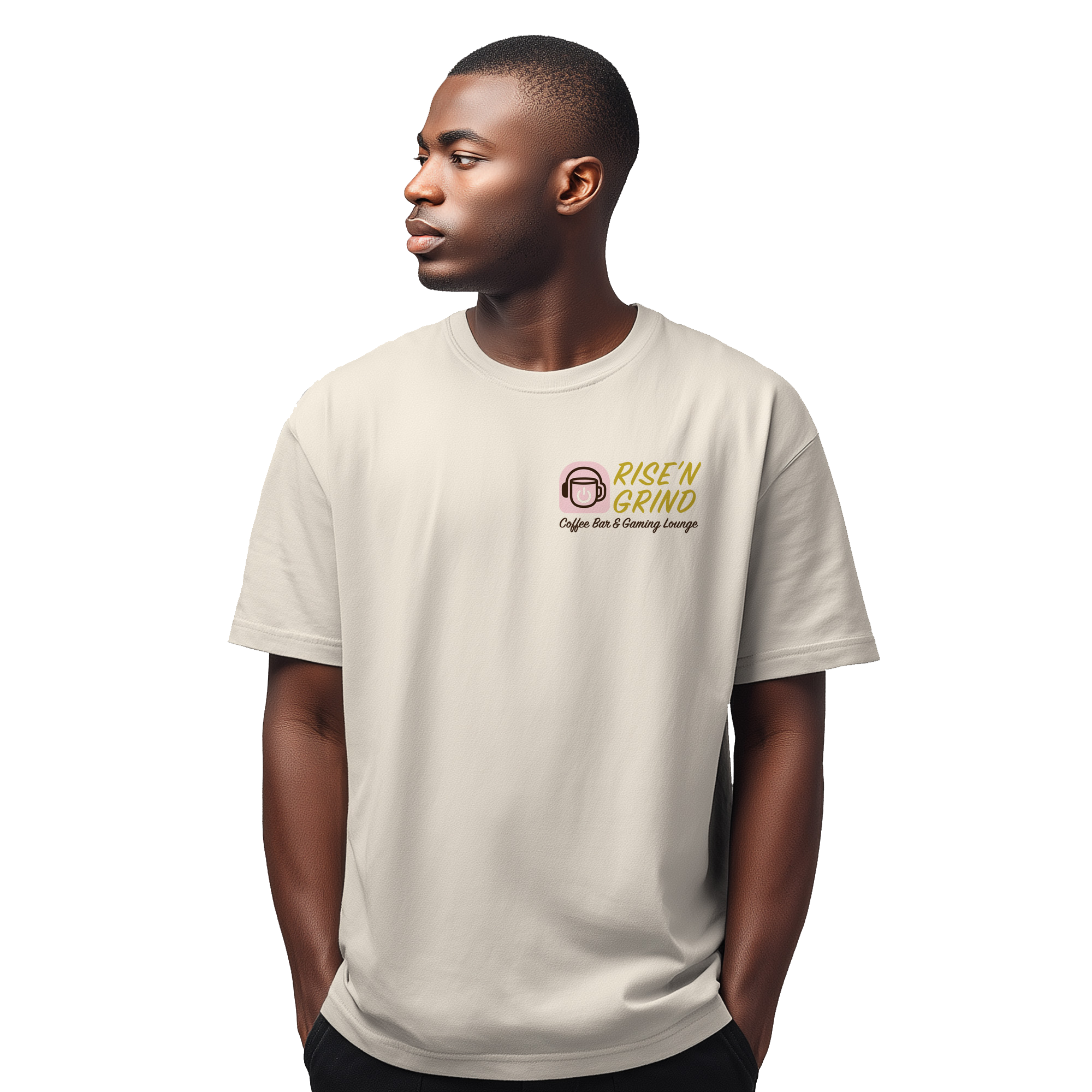
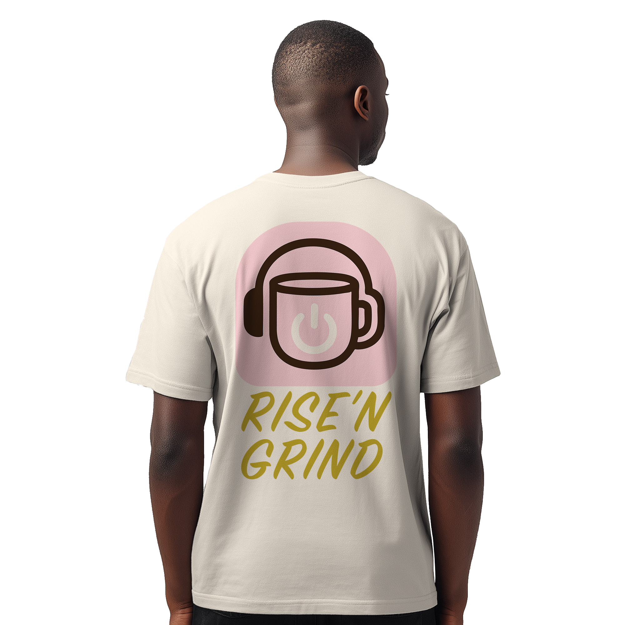
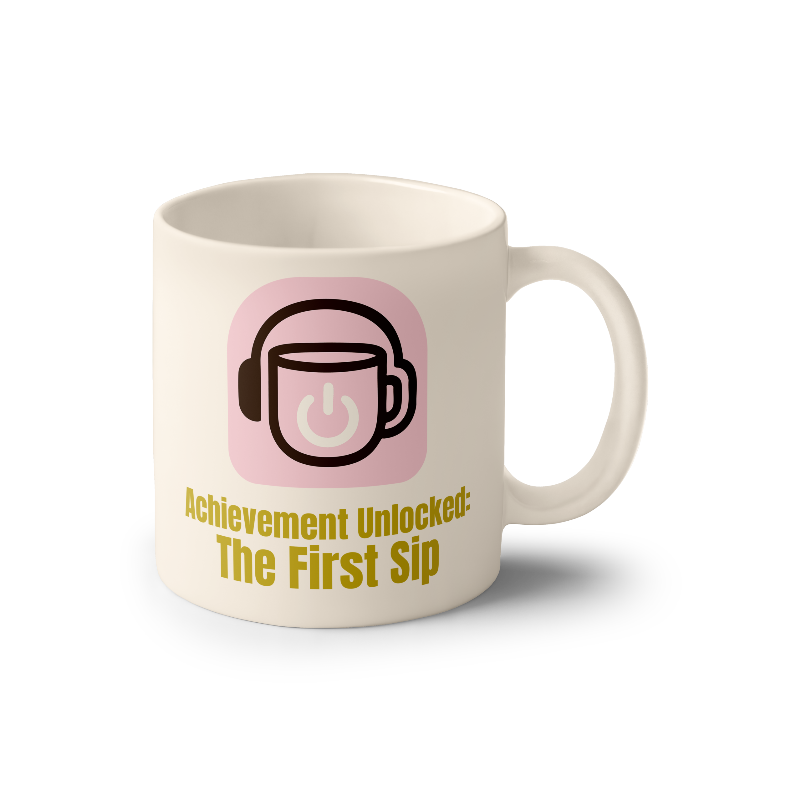
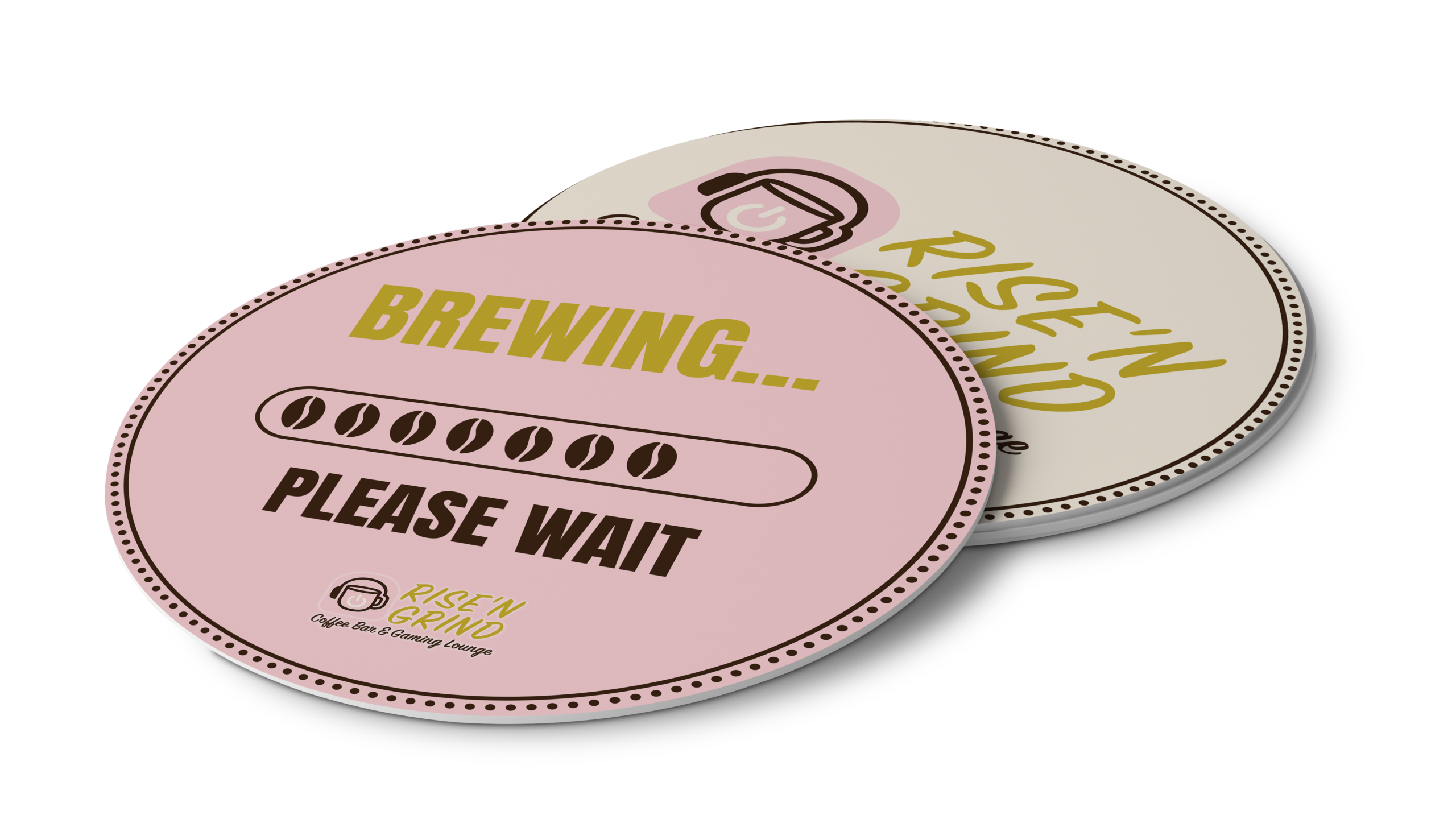
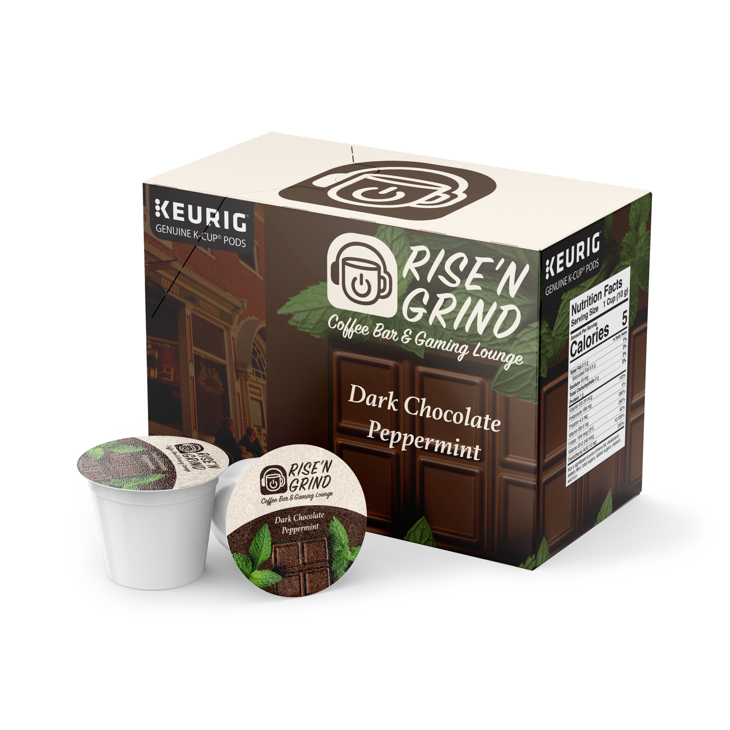
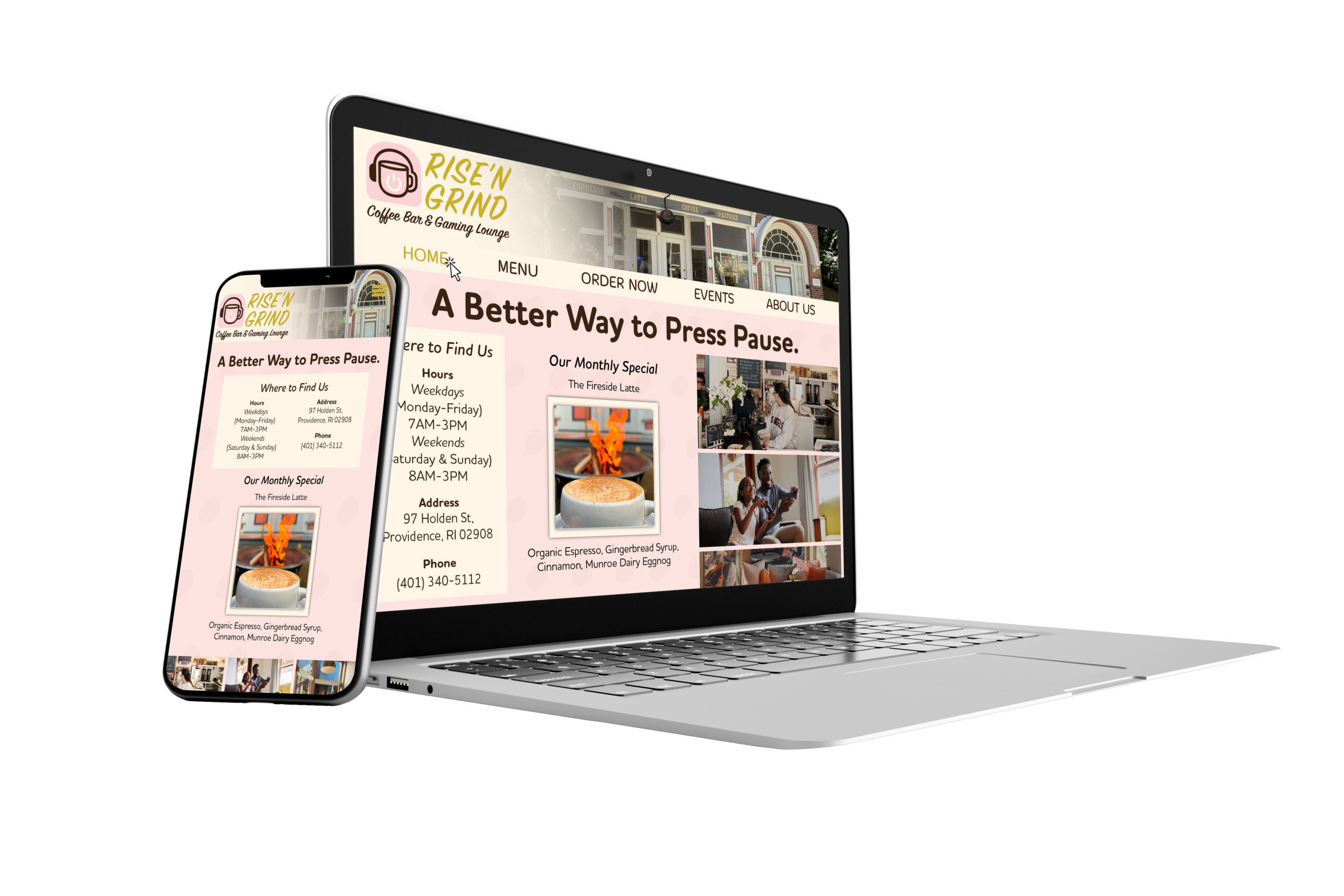
The redesigned Rise N’ Grind logo introduces a more expressive visual identity that reflects both coffee culture and gaming influences. Through the use of bold typography and graphic elements, the new logo establishes a stronger presence while clearly communicating the café’s unique concept. Overall, the updated branding creates a more memorable, engaging, and modern identity that aligns with the reimagined space.


Project Overview:
The objective for this assignment was to take a local coffee house and rebrand it with a new logo. The task, although timely, was quite simple. I, however, chose to take a more challenging route. Rather than rebranding with just a new logo, I decided to rebrand my chosen coffee house entirely.
Process Summary:
The design process began with selecting a local coffee shop in need of a rebrand. I chose Rise N’ Shine, a small café located in Providence, RI. While the shop had a lovely atmosphere, its semi-hidden location and weak branding, specifically in their website, made it feel easy to overlook.
Initially, I explored logo concepts that would help the café stand out visually. However, as I continued coming up with ideas, I realized the brand itself had the potential to become something more distinctive. This led to the decision to rebrand Rise N’ Shine as Rise N’ Grind.
Inspired by gaming culture, particularly the phrase “rise and grind,” commonly used to describe a person jumping straight into gameplay upon starting their day, I reimagined the café as a hybrid space that functions as both a coffee house and a gaming lounge. The name also serves as a double meaning, referencing both grinding in games and grinding coffee beans.
With this concept in mind, I developed logo designs that balanced gaming and coffee aesthetics, aiming to appeal to multiple audiences while giving the brand a more memorable and modern identity.


