
Climate Change Poster Case Study
Project Overview:
For this assignment, I created an educational poster focused on climate change. While the overall subject was defined, the project allowed significant creative freedom in how the topic was interpreted and presented. I chose to focus on global warming, a human-caused environmental crisis that has been intensifying for over 150 years. The goal was to communicate urgency while remaining visually engaging and accessible to a broad audience.
Process Summary:
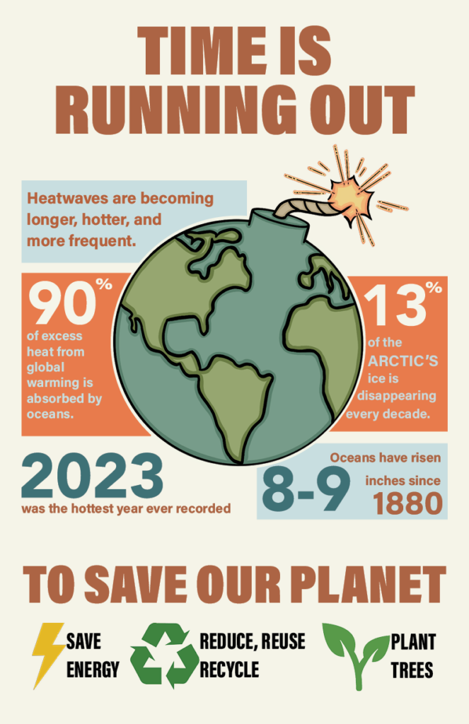
After selecting my topic, I began by sketching layout ideas and exploring visual concepts. I was drawn to the idea of depicting Earth as a lit bomb, a metaphor meant to represent urgency, rising global temperatures, and the limited time remaining to address the issue. The burning wick symbolized both heat and immediacy, while the Earth itself served as the core of the problem.
I illustrated the main image in Procreate and later placed it into InDesign, which allowed the poster to feel more personal and visually authentic. To ensure the design was eye-catching without being overwhelming, I paired bold typography with strong color contrast against an off-white background. These choices helped balance visual impact with readability and supported the educational intent of the poster.
Design Goals:
- Create an educational 11″ x 17″ climate change poster using InDesign.
Design Challenges:
One of the primary challenges of this project was communicating the seriousness of climate change without overwhelming or alienating the viewer. The poster needed to feel urgent and informative while remaining visually approachable and easy to understand. Balancing strong statistics with clear hierarchy was especially important to prevent the information from feeling crowded or intimidating.
Another challenge was translating an abstract, global issue into a single, impactful visual. Developing the Earth-as-a-bomb concept required careful execution so the imagery felt symbolic rather than overly aggressive. Ensuring that the illustration, typography, and color palette worked together cohesively was key to maintaining clarity and reinforcing the message.
Outcome:
The final poster effectively combines bold visual symbolism with accessible data to communicate the urgency of climate change. The central illustration immediately draws attention, while the surrounding statistics guide the viewer through the information in a clear, structured way. Strong typographic hierarchy and high-contrast color choices help key facts stand out and improve readability.
Overall, the design succeeds in presenting complex information in a way that is engaging, educational, and visually cohesive. This project strengthened my ability to use visual metaphor, organize data-driven content, and create impactful designs that balance emotion with clarity.
Closer Look at the Poster