Menu Redesign Case Study
Design Goals:
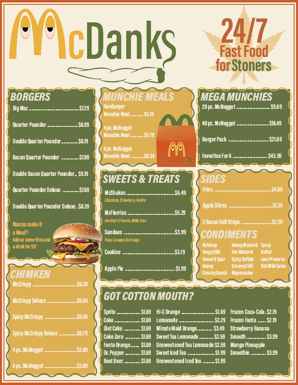
The goal of this project was to design a clear, engaging one-page take-out menu while practicing layout and typography skills in Adobe InDesign. I wanted the design to feel visually bold and humorous while still maintaining the readability and organization expected from a real restaurant menu.
Another objective was to develop a cohesive brand identity for the fictional “McDank’s” concept. This included creating a recognizable logo, establishing a consistent color palette, and designing a layout that guides the viewer naturally through the menu items.
Outcome:
The final menu successfully combines playful branding with a structured and readable layout. The custom logo, bold typography, and organized menu sections help reinforce the satirical fast-food concept while keeping the information easy to navigate.
Through this project, I strengthened my ability to translate sketches into a polished digital layout using Adobe InDesign. It also gave me experience balancing creative concepts with practical design considerations such as hierarchy, spacing, and clarity.

Project Overview
The objective of this project was to design a one-page take-out or curbside menu for a food-based business of my choice. The assignment focused on building foundational skills in Adobe InDesign while applying design concepts, terminology, and layout principles introduced earlier in the course. Emphasis was placed on creating a clear, well-structured layout that balances visual appeal with usability.
This project served as an opportunity to strengthen my technical proficiency in InDesign while practicing typography, spacing, and hierarchy within a real-world design scenario.
Process Summary:
Given the creative freedom of the assignment, I chose to approach the project with a playful and unconventional concept. I reimagined McDonald’s as “McDank’s,” a satirical rebrand targeting a cannabis-friendly audience. With cannabis becoming more widely legalized and culturally mainstream, the concept allowed me to explore humor and branding while still meeting the functional requirements of a menu design.
I began by sketching logo concepts and refined the final mark in Adobe Illustrator. From there, I sketched multiple menu layout ideas, focusing on hierarchy, readability, and organization. Once the structure was finalized, I recreated the design digitally in Adobe InDesign, using the program’s layout and typography tools to bring the concept together into a cohesive one-page menu.
A Look at the Sketch

A Closer Look at the Menu