1950's Advertisements Case Study
Project Overview:
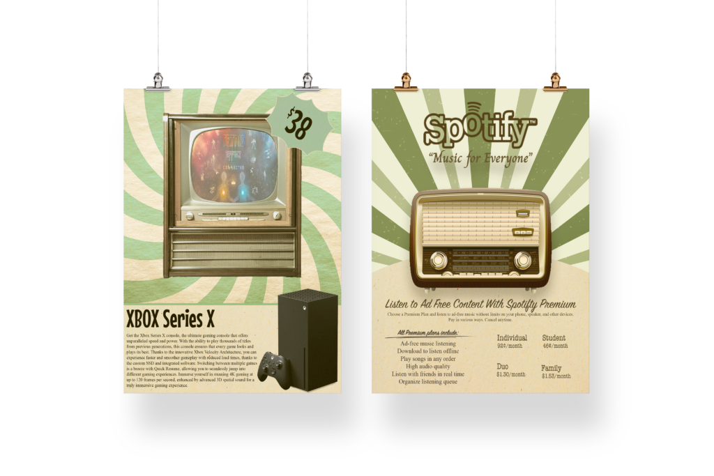
For this assignment, I was tasked with advertising two modern-day products as if they were being marketed in the 1950s. The goal was to study the visual language of mid-century advertising and reinterpret contemporary products through a retro lens. This project focused on understanding how typography, composition, color, and imagery were historically used to sell products, while creatively adapting those conventions to fit modern brands.
Process Summary:
I began by researching and analyzing advertisements from the 1950s, paying close attention to layout styles, typographic choices, color palettes, and product presentation. This research helped establish a visual foundation and informed the overall tone and aesthetic of my designs.
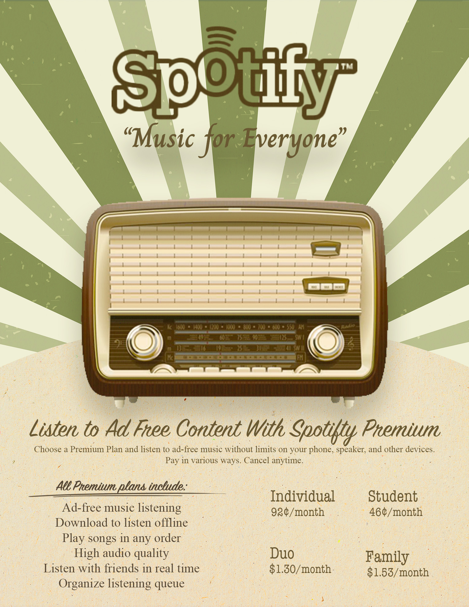
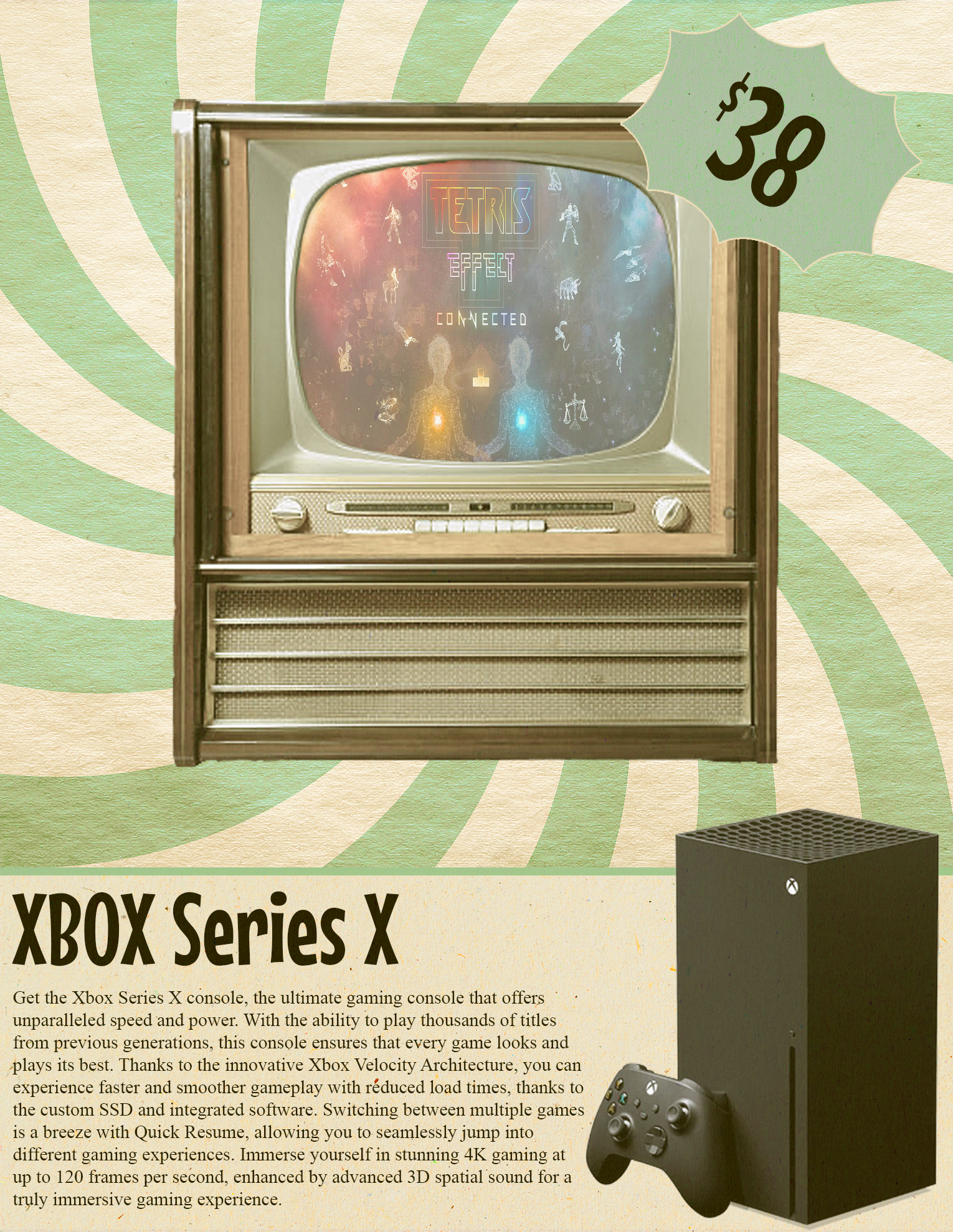
After selecting two modern products—the Xbox Series X and Spotify—I created preliminary sketches to plan composition and visual hierarchy. Once the concepts were finalized, I brought the designs to life in Adobe Illustrator, using vintage-inspired textures, type treatments, and illustration styles to evoke the look and feel of mid-century print advertising while maintaining clear product recognition.
Design Goals:
- Create 2 unique advertisements for modern-day products visually styled and toned to the 1950’s
- Study and replicate mid-century design characteristics, such as bold typography, structured layouts, illustrated imagery, and limited color palettes
SPECIFICATIONS:
- Size: 8.5 x 11 inches (Portrait orientation only!)
- Resolution: 180 ppi
- Color Mode: RGB
Outcome:
The final advertisements successfully reinterpret Spotify and the Xbox Series X through a 1950s design lens. By combining retro-inspired typography, textures, and compositions with modern product messaging, the ads feel both nostalgic and recognizable. Each piece reflects careful attention to period-specific design conventions while maintaining clarity and visual impact.
This project strengthened my ability to analyze historical design styles and translate them into cohesive, original work. It also reinforced the importance of research-driven design and demonstrated my ability to adapt modern branding to fit a specific aesthetic and time period.
A Closer Look at the Advertisements