Newsletter Case Study
Design Goals:
- Create a four-page newsletter that feels expressive and fan-driven rather than overly formal
- Reflect the personality and creative energy of Tyler, The Creator through layout, typography, and color
- Design a cohesive publication that balances bold visuals with readable content
- Establish a clear visual hierarchy that guides the reader through each spread
- Use album-inspired imagery and themes to unify the newsletter’s overall aesthetic
Outcome:
The final newsletter successfully captures the feel of a monthly fan-club publication, combining playful design choices with intentional layout structure. Through the use of expressive typography, bold imagery, and cohesive color palettes, the design reflects Tyler’s creative identity while remaining engaging and readable. The project demonstrates my ability to develop a strong visual concept and carry it consistently across multiple pages within a print layout.
Project Overview
The objective of this assignment was to design a four-page newsletter, including a front and back cover, using InDesign. The topic and creative direction were open-ended, allowing for full control over both content and visual style.
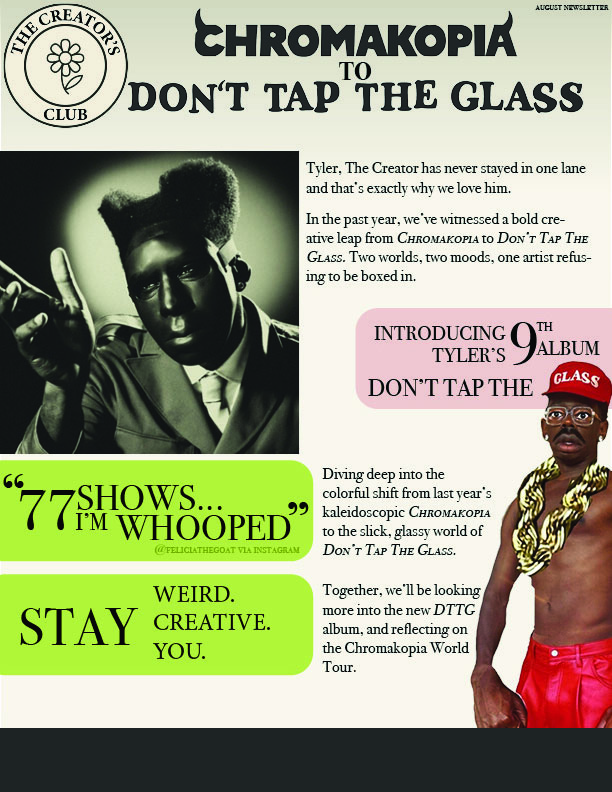
I chose to create a newsletter centered around Tyler, The Creator, designed as if it were part of a monthly fan club subscription. The goal was to create a publication that felt expressive and personality-driven rather than overly polished or corporate, reflecting Tyler’s creative identity.
Process Summary:
I began the project by defining the overall tone and audience for the newsletter. I wanted it to feel casual, immersive, and visually engaging—more like a fan-created publication than a traditional newsletter.
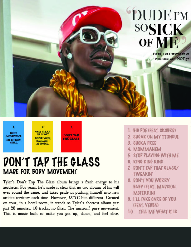
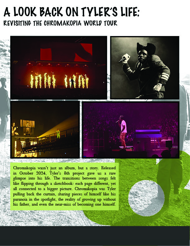
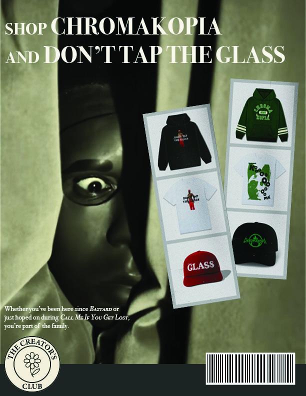
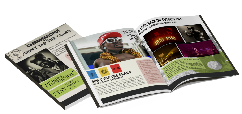
After sketching layout ideas, I developed a clean but expressive logo that supported the tone without overpowering the content. The newsletter focuses on Tyler’s recent albums CHROMAKOPIA and DON’T TAP THE GLASS, using them as visual and thematic anchors throughout the spreads.
From there, I designed the layouts in InDesign, balancing imagery, typography, and color to maintain visual interest while keeping the content readable. Album-related imagery and design elements were selected to complement the overall aesthetic and reinforce the fan-club concept.
Closer Look at the Pages