Trifold Brochure Case Study
Project Overview:
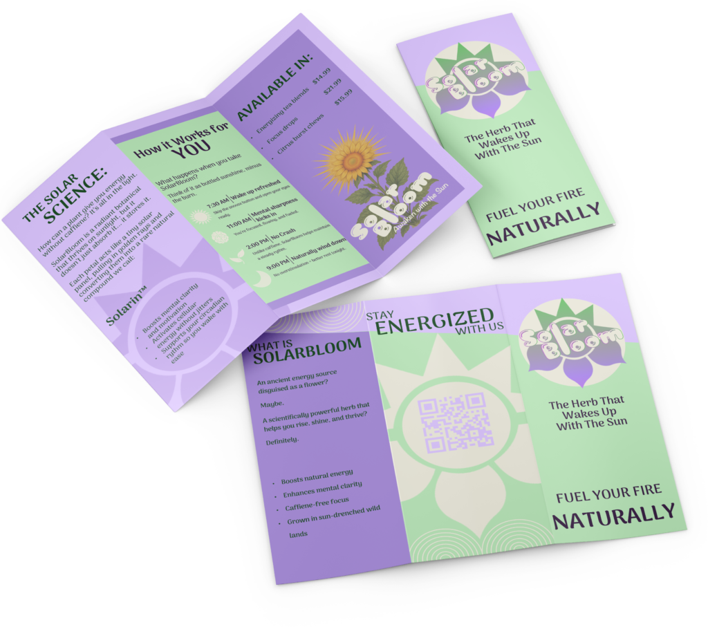
The objective of this assignment was to design an informational tri-fold brochure for an herbal tea company, whether real or hypothetical.
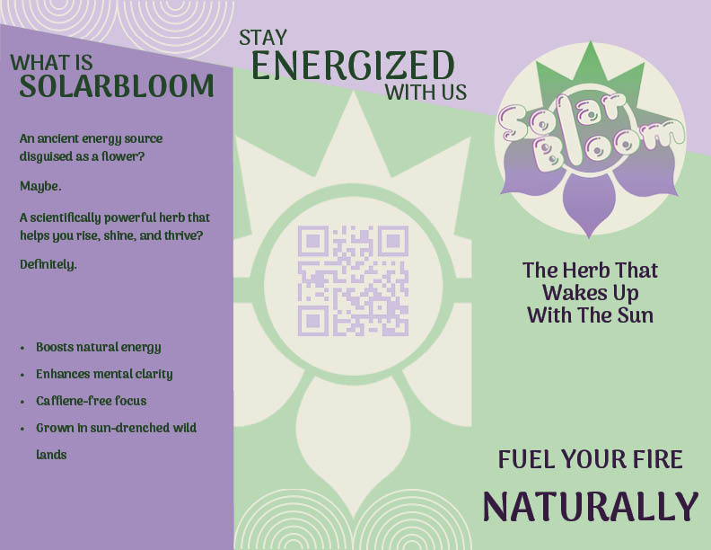
I created SolarBloom, a caffeine-free tea designed to promote energy and wellness without relying on stimulants. The brand focuses on natural vitality, warmth, and balance, which guided both the visual and conceptual direction of the brochure.
Process Summary:
I began the design process by establishing a color palette that reflected the calming yet energizing qualities of the tea, ultimately selecting a combination of purples and greens. From there, I developed the name SolarBloom and designed a logo that supported the brand’s natural and uplifting identity.
With the branding in place, I designed the tri-fold layout, treating the brochure as a visual narrative that guides the viewer through the product’s purpose, benefits, and personality. Typography, imagery, and spacing were carefully considered to maintain clarity while reinforcing the overall tone of the brand.
Design Goals:
- Create a 2-sided tri-fold brochure using InDesign, for an herb company.
SPECIFICATIONS:
- 11” x 8 ½”
- 3 columns
- Use at least 2 colors
- Use at least 2 fonts (no more than 3)
Design Challenges:
One of the main challenges in this project was defining the overall visual direction. Early on, I experimented with lighter color palettes that felt appropriate for an herbal tea brand, but these options lost contrast and clarity once printed.
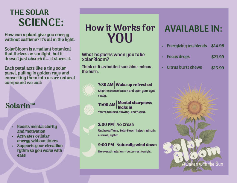
Another challenge was refining the color combinations to ensure both readability and visual balance. After testing multiple variations, I shifted toward darker, higher-contrast pairings—using deep purple text on green backgrounds and dark green text on purple backgrounds. This solution improved legibility while maintaining the calm, natural tone of the brand.
Outcome:
The final brochure presents SolarBloom as a refreshing and approachable herbal tea brand. Through thoughtful color choices, cohesive branding, and a clear layout, the design communicates both energy and calm, successfully supporting the product’s intended purpose.
Closer Look at the Pages