
Summer Pops Case Study
Design Goals:
- Create on poster design for The Chorus of Westerly Summer Pops
SPECIFICATIONS
- Use Photoshop as your program
- 11″ x 17″ document
MUST INCLUDE
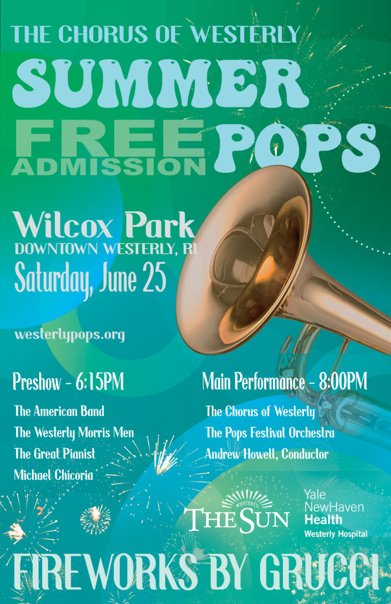
- Headline (Summer Pops)
- Location
- Date
- Admission fee
- Pre-show time and performances
- Main show time and performances
- Website
- Sponsors
- Provided logos
Design Challenges:
One of the main challenges of this project was navigating both the design brief and Adobe Photoshop during my first term of college. Wanting to create an impressive final piece, I initially rushed the process instead of allowing time for exploration. Through experimentation and revision, I learned that strong design outcomes come from patience, refinement, and thoughtful decision-making.
Outcome:
The final poster successfully presents all required information in a clear, engaging, and visually cohesive way. Through intentional typography choices, a vibrant yet balanced color palette, and strong visual hierarchy, the design conveys the excitement of a summer concert while remaining accessible and easy to read. After experimenting with lighter color options that proved less effective in print, the final solution uses darker, high-contrast color combinations to improve legibility and visual strength.
Project Overview
The objective of this project was to design an 11″ × 17″ promotional poster for The Chorus of Westerly Summer Popsconcert. The poster needed to clearly communicate key event information—including date, location, performers, admission details, and sponsors—while capturing the celebratory, outdoor summer atmosphere of the event. Designed in Photoshop, the project emphasized hierarchy, readability, and visual impact to ensure the poster would be effective both from a distance and up close. The overall creative direction focused on blending a festive, musical tone with a polished layout suitable for a community-focused arts organization.
Process Summary:
I began the project by reviewing the design requirements and identifying the essential information that needed to be clearly communicated on the poster. I explored multiple layout ideas via sketches to establish a strong visual hierarchy, prioritizing the event name, date, and location. Early design iterations focused on lighter color palettes to reflect a summer theme, but testing revealed legibility and contrast issues, particularly for print.
Based on these findings, I refined the color scheme and shifted toward deeper, higher-contrast tones that improved readability while still maintaining a vibrant, festive feel. Typography experiments helped balance playful, expressive type with more structured fonts to ensure clarity across headings and detailed event information. Throughout the process, I made adjustments to spacing, alignment, and scale to guide the viewer’s eye naturally through the poster. The final design reflects a thoughtful progression from concept to execution, informed by testing, refinement, and attention to both aesthetic and functional requirements.
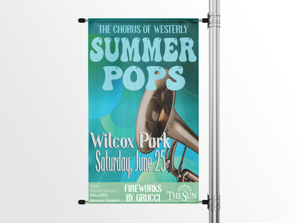
Mockups for Summer Pops
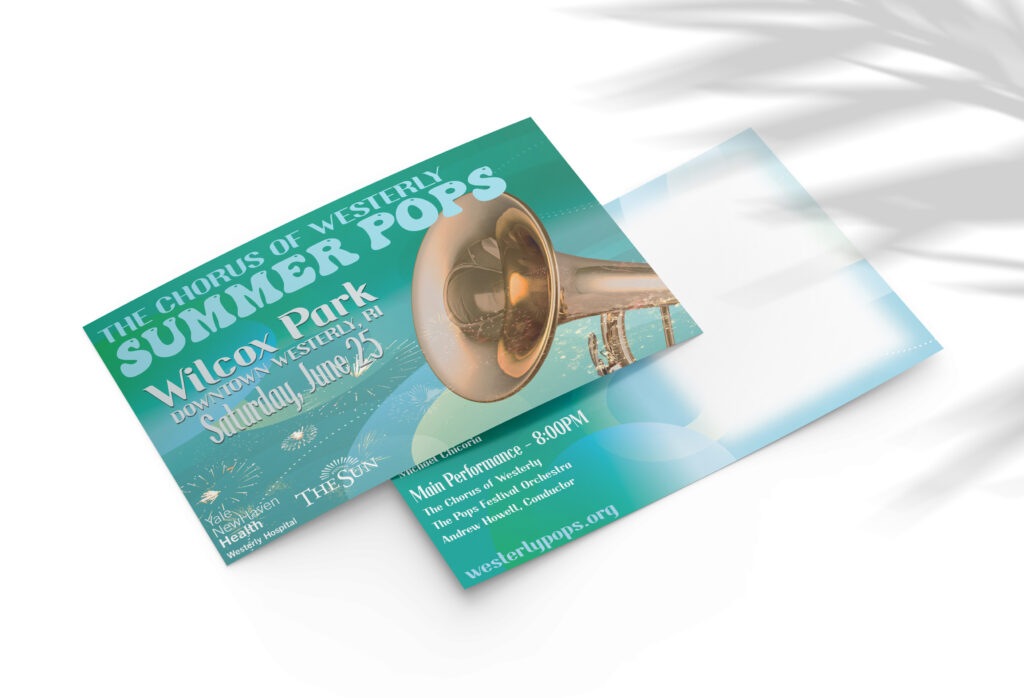
Postcard
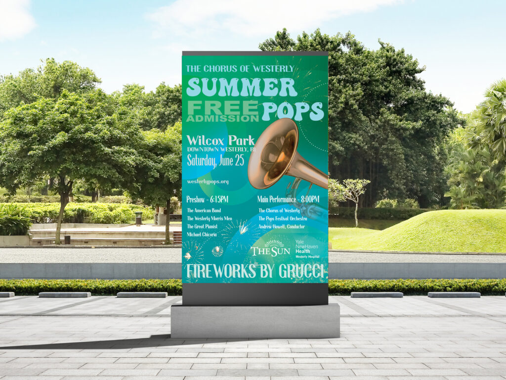
Outdoor Signage