Climate Change Poster Case Study
Climate Change Poster Case Study Project Overview: For this assignment, I created an educational poster focused on climate change. While the overall subject was defined, the project allowed significant creative freedom in how the topic was interpreted and presented. I chose to focus on global warming, a human-caused environmental crisis that has been intensifying for over 150 years. The goal was to communicate urgency while remaining visually engaging and accessible to a broad audience. Process Summary: After selecting my topic, I began by sketching layout ideas and exploring visual concepts. I was drawn to the idea of depicting Earth as a lit bomb, a metaphor meant to represent urgency, rising global temperatures, and the limited time remaining to address the issue. The burning wick symbolized both heat and immediacy, while the Earth itself served as the core of the problem. I illustrated the main image in Procreate and later placed it into InDesign, which allowed the poster to feel more personal and visually authentic. To ensure the design was eye-catching without being overwhelming, I paired bold typography with strong color contrast against an off-white background. These choices helped balance visual impact with readability and supported the educational intent of the poster. Design Goals: Create an educational 11″ x 17″ climate change poster using InDesign. Design Challenges: One of the primary challenges of this project was communicating the seriousness of climate change without overwhelming or alienating the viewer. The poster needed to feel urgent and informative while remaining visually approachable and easy to understand. Balancing strong statistics with clear hierarchy was especially important to prevent the information from feeling crowded or intimidating. Another challenge was translating an abstract, global issue into a single, impactful visual. Developing the Earth-as-a-bomb concept required careful execution so the imagery felt symbolic rather than overly aggressive. Ensuring that the illustration, typography, and color palette worked together cohesively was key to maintaining clarity and reinforcing the message. Outcome: The final poster effectively combines bold visual symbolism with accessible data to communicate the urgency of climate change. The central illustration immediately draws attention, while the surrounding statistics guide the viewer through the information in a clear, structured way. Strong typographic hierarchy and high-contrast color choices help key facts stand out and improve readability. Overall, the design succeeds in presenting complex information in a way that is engaging, educational, and visually cohesive. This project strengthened my ability to use visual metaphor, organize data-driven content, and create impactful designs that balance emotion with clarity. Closer Look at the Poster
Summer Pops Case Study
Summer Pops Case Study Design Goals: Create on poster design for The Chorus of Westerly Summer Pops SPECIFICATIONS Use Photoshop as your program 11″ x 17″ document MUST INCLUDE Headline (Summer Pops) Location Date Admission fee Pre-show time and performances Main show time and performances Website Sponsors Provided logos Design Challenges: One of the main challenges of this project was navigating both the design brief and Adobe Photoshop during my first term of college. Wanting to create an impressive final piece, I initially rushed the process instead of allowing time for exploration. Through experimentation and revision, I learned that strong design outcomes come from patience, refinement, and thoughtful decision-making. Outcome: The final poster successfully presents all required information in a clear, engaging, and visually cohesive way. Through intentional typography choices, a vibrant yet balanced color palette, and strong visual hierarchy, the design conveys the excitement of a summer concert while remaining accessible and easy to read. After experimenting with lighter color options that proved less effective in print, the final solution uses darker, high-contrast color combinations to improve legibility and visual strength. Project Overview The objective of this project was to design an 11″ × 17″ promotional poster for The Chorus of Westerly Summer Popsconcert. The poster needed to clearly communicate key event information—including date, location, performers, admission details, and sponsors—while capturing the celebratory, outdoor summer atmosphere of the event. Designed in Photoshop, the project emphasized hierarchy, readability, and visual impact to ensure the poster would be effective both from a distance and up close. The overall creative direction focused on blending a festive, musical tone with a polished layout suitable for a community-focused arts organization. Process Summary: I began the project by reviewing the design requirements and identifying the essential information that needed to be clearly communicated on the poster. I explored multiple layout ideas via sketches to establish a strong visual hierarchy, prioritizing the event name, date, and location. Early design iterations focused on lighter color palettes to reflect a summer theme, but testing revealed legibility and contrast issues, particularly for print.Based on these findings, I refined the color scheme and shifted toward deeper, higher-contrast tones that improved readability while still maintaining a vibrant, festive feel. Typography experiments helped balance playful, expressive type with more structured fonts to ensure clarity across headings and detailed event information. Throughout the process, I made adjustments to spacing, alignment, and scale to guide the viewer’s eye naturally through the poster. The final design reflects a thoughtful progression from concept to execution, informed by testing, refinement, and attention to both aesthetic and functional requirements. Mockups for Summer Pops Postcard Outdoor Signage Flagpole Poster
Trifold Brochure Case Study
Trifold Brochure Case Study Project Overview: The objective of this assignment was to design an informational tri-fold brochure for an herbal tea company, whether real or hypothetical. I created SolarBloom, a caffeine-free tea designed to promote energy and wellness without relying on stimulants. The brand focuses on natural vitality, warmth, and balance, which guided both the visual and conceptual direction of the brochure. Process Summary: I began the design process by establishing a color palette that reflected the calming yet energizing qualities of the tea, ultimately selecting a combination of purples and greens. From there, I developed the name SolarBloom and designed a logo that supported the brand’s natural and uplifting identity. With the branding in place, I designed the tri-fold layout, treating the brochure as a visual narrative that guides the viewer through the product’s purpose, benefits, and personality. Typography, imagery, and spacing were carefully considered to maintain clarity while reinforcing the overall tone of the brand. Design Goals: Create a 2-sided tri-fold brochure using InDesign, for an herb company. SPECIFICATIONS: 11” x 8 ½” 3 columns Use at least 2 colors Use at least 2 fonts (no more than 3) Design Challenges: One of the main challenges in this project was defining the overall visual direction. Early on, I experimented with lighter color palettes that felt appropriate for an herbal tea brand, but these options lost contrast and clarity once printed. Another challenge was refining the color combinations to ensure both readability and visual balance. After testing multiple variations, I shifted toward darker, higher-contrast pairings—using deep purple text on green backgrounds and dark green text on purple backgrounds. This solution improved legibility while maintaining the calm, natural tone of the brand. Outcome: The final brochure presents SolarBloom as a refreshing and approachable herbal tea brand. Through thoughtful color choices, cohesive branding, and a clear layout, the design communicates both energy and calm, successfully supporting the product’s intended purpose. Closer Look at the Pages
Newsletter Case Study
Newsletter Case Study Design Goals: Create a four-page newsletter that feels expressive and fan-driven rather than overly formal Reflect the personality and creative energy of Tyler, The Creator through layout, typography, and color Design a cohesive publication that balances bold visuals with readable content Establish a clear visual hierarchy that guides the reader through each spread Use album-inspired imagery and themes to unify the newsletter’s overall aesthetic Outcome: The final newsletter successfully captures the feel of a monthly fan-club publication, combining playful design choices with intentional layout structure. Through the use of expressive typography, bold imagery, and cohesive color palettes, the design reflects Tyler’s creative identity while remaining engaging and readable. The project demonstrates my ability to develop a strong visual concept and carry it consistently across multiple pages within a print layout. Project Overview The objective of this assignment was to design a four-page newsletter, including a front and back cover, using InDesign. The topic and creative direction were open-ended, allowing for full control over both content and visual style. I chose to create a newsletter centered around Tyler, The Creator, designed as if it were part of a monthly fan club subscription. The goal was to create a publication that felt expressive and personality-driven rather than overly polished or corporate, reflecting Tyler’s creative identity. Process Summary: I began the project by defining the overall tone and audience for the newsletter. I wanted it to feel casual, immersive, and visually engaging—more like a fan-created publication than a traditional newsletter. After sketching layout ideas, I developed a clean but expressive logo that supported the tone without overpowering the content. The newsletter focuses on Tyler’s recent albums CHROMAKOPIA and DON’T TAP THE GLASS, using them as visual and thematic anchors throughout the spreads. From there, I designed the layouts in InDesign, balancing imagery, typography, and color to maintain visual interest while keeping the content readable. Album-related imagery and design elements were selected to complement the overall aesthetic and reinforce the fan-club concept. Closer Look at the Pages Front Cover Inner Page #1 Inner Page #2 Back Cover
Coffee House Case Study
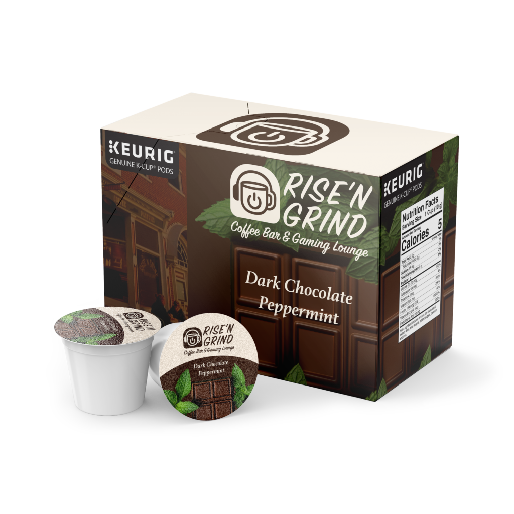
Coffee House Rebrand Case Study Challenges: Throughout the rebranding process, I faced several challenges. Because the project extended beyond designing a logo to reimagining the coffee house as a whole, it was essential to find the right balance between gaming culture and a welcoming coffee shop aesthetic. Another challenge was determining the initial direction for the logo. The original branding consisted solely of text, which made it difficult to decide how far to push the redesign while still creating something cohesive and recognizable. Key Aspects: Target Audience: teens to adults New Logo: clearly grasps the look of both a coffee house and a gaming lounge and is much more eye-catching to the public than the previous logo Before & After: The original Rise N’ Shine logo was a text-only design, which offered limited visual impact and did little to communicate the personality or atmosphere of the café. While functional, the logo lacked a distinctive identity and did not reflect the potential for the brand to stand out within the local coffee scene. The redesigned Rise N’ Grind logo introduces a more expressive visual identity that reflects both coffee culture and gaming influences. Through the use of bold typography and graphic elements, the new logo establishes a stronger presence while clearly communicating the café’s unique concept. Overall, the updated branding creates a more memorable, engaging, and modern identity that aligns with the reimagined space. Project Overview: The objective for this assignment was to take a local coffee house and rebrand it with a new logo. The task, although timely, was quite simple. I, however, chose to take a more challenging route. Rather than rebranding with just a new logo, I decided to rebrand my chosen coffee house entirely. Process Summary: The design process began with selecting a local coffee shop in need of a rebrand. I chose Rise N’ Shine, a small café located in Providence, RI. While the shop had a lovely atmosphere, its semi-hidden location and weak branding, specifically in their website, made it feel easy to overlook. Initially, I explored logo concepts that would help the café stand out visually. However, as I continued coming up with ideas, I realized the brand itself had the potential to become something more distinctive. This led to the decision to rebrand Rise N’ Shine as Rise N’ Grind. Inspired by gaming culture, particularly the phrase “rise and grind,” commonly used to describe a person jumping straight into gameplay upon starting their day, I reimagined the café as a hybrid space that functions as both a coffee house and a gaming lounge. The name also serves as a double meaning, referencing both grinding in games and grinding coffee beans. With this concept in mind, I developed logo designs that balanced gaming and coffee aesthetics, aiming to appeal to multiple audiences while giving the brand a more memorable and modern identity. Mock-Ups T-shirt Front T-shirt Back Mug Coasters Keurig Coffee Box Web Design